Google’s Pixel 9 Pro Fold is design evolution done right
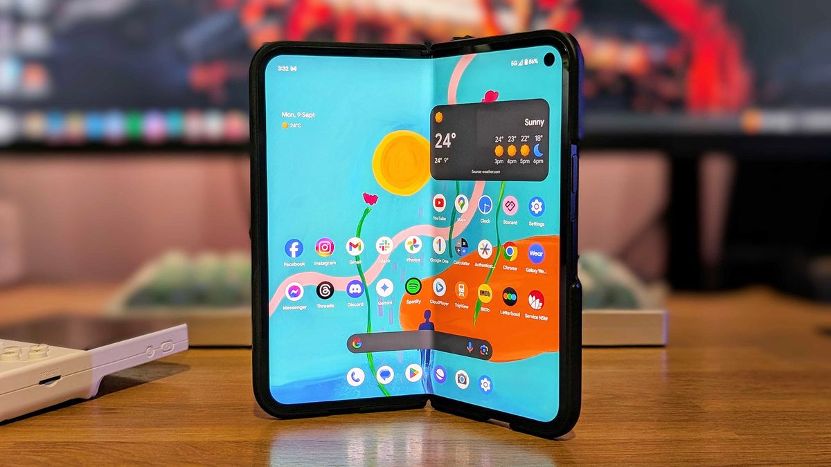
Last month, I declared that I was finally ready to ditch my Samsung phone thanks to Google’s Pixel 9 Pro XL. However, that particular handset was always intended as a stopgap — a way to experience and get used to the Pixel lifestyle ahead of the Pixel 9 Pro Fold’s imminent arrival.
Now that the Pixel 9 Pro Fold is here, I can say that it has lived up to my expectations, offering what I believe to be the best design to date for a book-style foldable device. I absolutely agree with our Pixel 9 Pro Fold review, which describes the device as “a dramatically improved foldable” and “much more polished in every way.”
Yes, it’s true that Google’s foldable journey didn’t get off to a great start — released just last year, the Google Pixel Fold was the search giant’s first attempt at a foldable device, and while many appreciated the handset/tablet hybrid’s passport-inspired shape, it was outclassed by the competition in most other aspects of its design.
For starters, the Pixel Fold sported huge bezels on its interior display, along with a visible hinge mechanism above and below the screen which drew additional attention to the device’s thick plastic borders.
And while the Pixel Fold’s short and wide dimensions proved handy when the device was closed, it also resulted in an unusual 17.4:9 aspect ratio on its unfolded display, making it difficult for many apps to scale properly.
In short, the original Pixel Fold immediately felt several generations behind what Samsung’s Galaxy Z Fold series was doing in terms of design. But while I was ready to write off Google’s entry into the foldable category as a misstep, what happened next surprised the hell out of me.
Unlike Samsung, which has been reluctant to give its Z Fold series the shake up it desperately needs, Google went back to the drawing board for its second foldable, delivering a device which everyone can agree is a radical improvement over last year’s model.
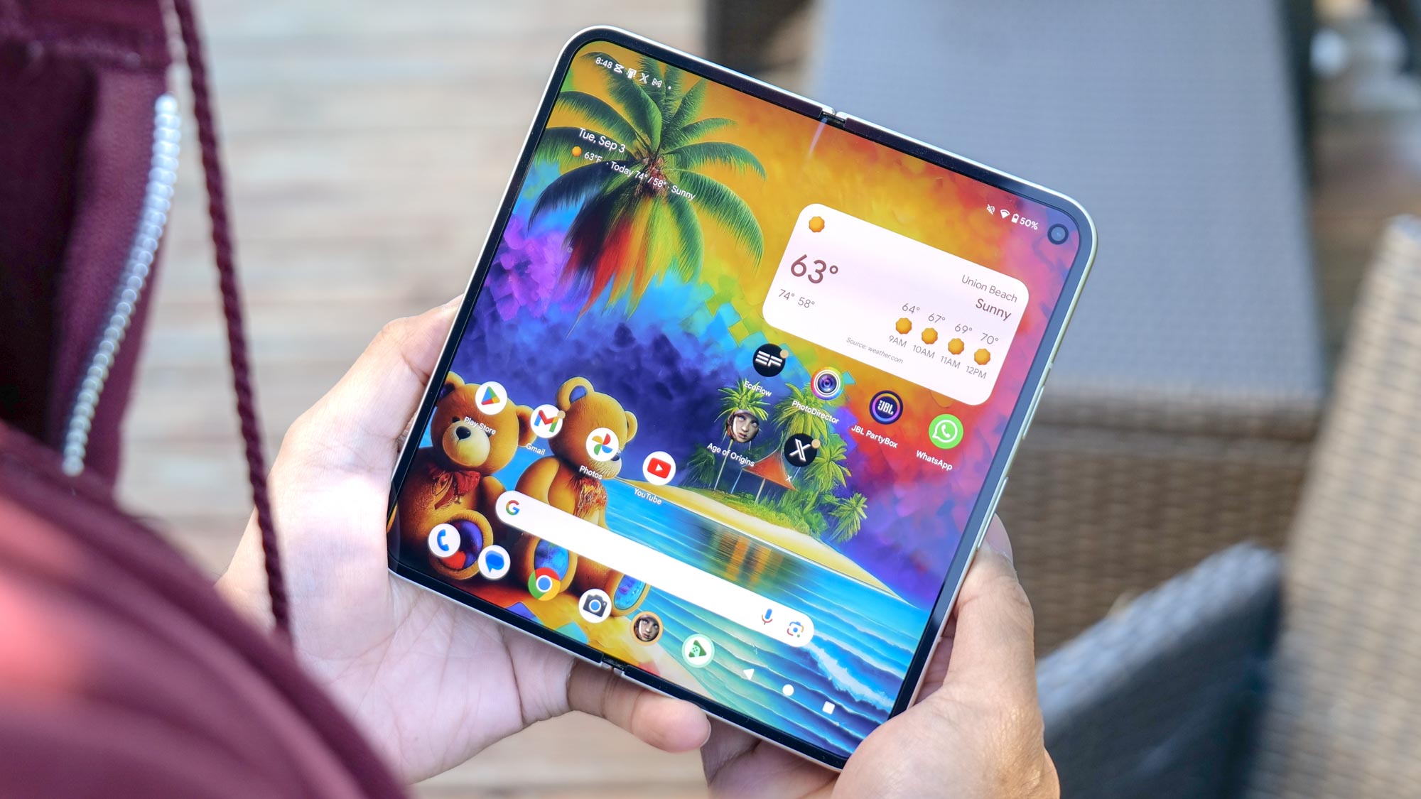
In fact, I will go on the record as saying that we’ve seen more of a design change between last year’s Pixel Fold and the new Pixel 9 Pro Fold than we’ve seen in six generations of Galaxy Z Fold devices. Instead of doubling down (or in the Z Fold’s case, sextupling down) on questionable design decisions, Google has made an effort to turn things around on its immediate follow-up — a refreshing approach in a time when new iPhones look practically identical every year.
Ditching the squat design of its predecessor, the Pixel 9 Pro Fold offers a front screen with the same 6.3-inch dimensions and 20:9 aspect ratio as the standard Pixel 9. Having used the Pixel 9 Pro Fold as my daily driver for the last couple of weeks, I can say that its outer display is just as comfortable to type on as any other similarly sized non-folding phone.
Of course, the Pixel 9 Pro Fold’s biggest glow-up becomes evident when the device is unfolded — the first thing you’ll notice is that the bezel around the second gen Fold’s interior display has been drastically reduced, significantly upping the foldable’s premium factor. The device now has a pinhole camera in the display rather than one hidden within a thick bezel, which I prefer wholeheartedly.
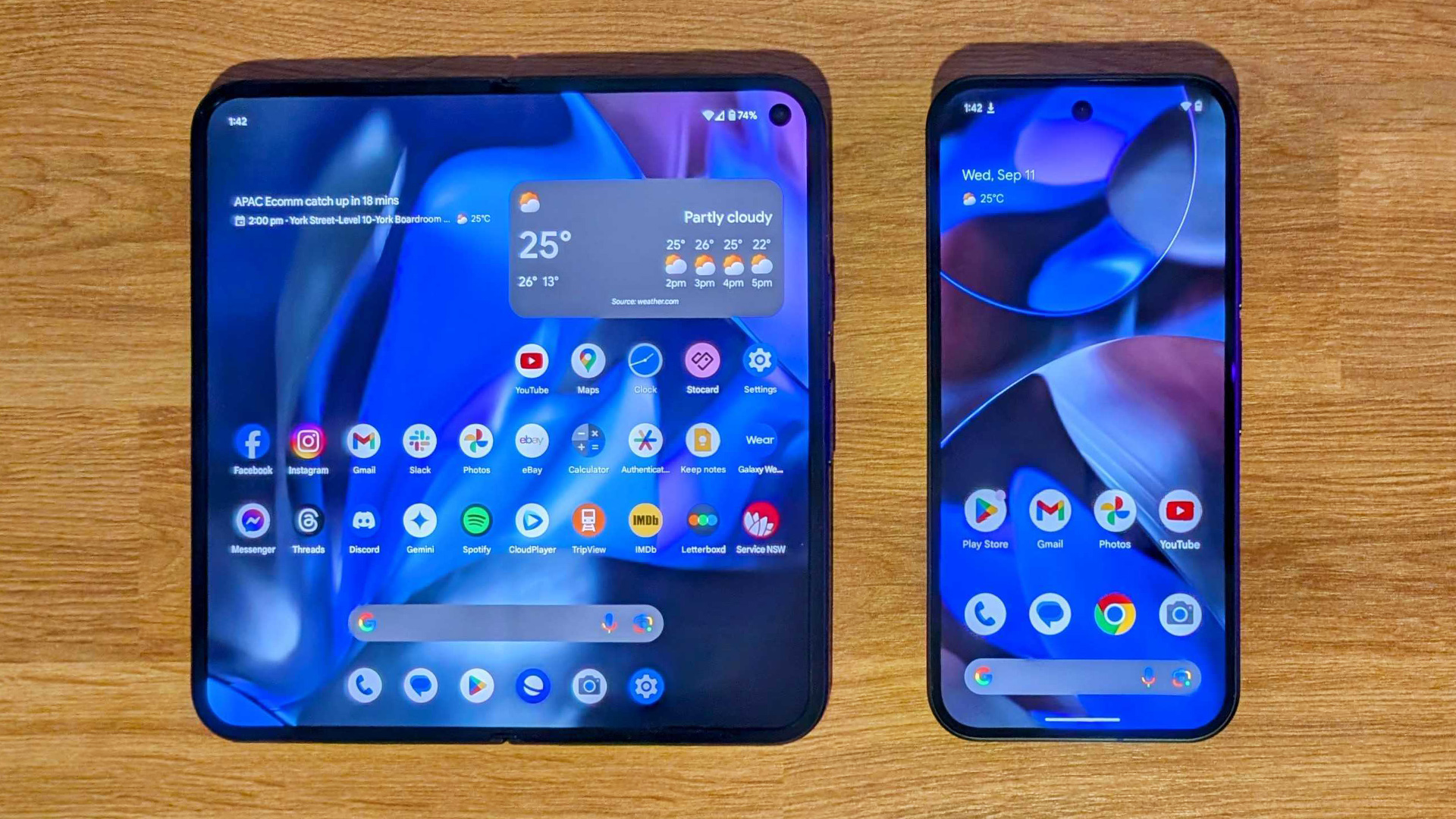
Next, the interior display now has a more manageable 6:5 aspect ratio (very nearly a square) which seems to work extremely well with most apps. In fact, I’ve found it to be the perfect shape for multi-tasking, because each half of the display is the size of a standard Pixel 9. This shape also allows the Pixel 9 Pro Fold to sport an 8-inch display — the largest on any handset to date.
It’s also worth noting that the interior display’s crease is less pronounced on the Pixel 9 Pro Fold, and that the screen itself is more than twice as bright, hitting a peak brightness of 2,319 nits in our tests, compared to around 1,000 nits on its predecessor.
That’s not to say the Pixel 9 Pro Fold is perfect — there are still things about it which could be improved, starting with its Tensor G4’s performance. While the device is understandably more focused on productivity and Gemini AI features than gaming, Samsung’s Galaxy Z Fold 6 is only slightly more expensive and is capable of both. The Pixel 9 Pro Fold also lacks stylus functionality, which would make it even more useful for productivity.
Still, I believe the Pixel 9 Pro Fold is arguably the most improved sophomore effort from a phone maker that we’ve seen in years, demonstrating Google’s willingness to make drastic changes for the sake of a better product. Take note, competitors.
More from Tom’s Guide
Source link


