Whether you’re creating an attractive business presentation, an engaging college lesson, or an online quiz, PowerPoint’s tools can help you make your slides look the part. Regardless of their purpose, professionally designed PowerPoint presentations increase the impact of whatever you’re delivering.
Here are the top tips for making the best impression through Microsoft’s slideshow program.
1 Title Slide: Get Off to a Good Start
Your presentation doesn’t begin when you start speaking. In fact, it starts as soon as the audience enters the room, especially if you have a title slide already displayed on the screen. A good title slide grabs people’s attention, sets the tone for the session, and reminds everyone of the topic at hand. An excellent title slide, however, also makes your audience engage directly with its content.
Whether you’re starting with a blank canvas, using one of PowerPoint’s theme templates, or taking advantage of the Designer sidebar through the Design tab (see the screenshot below), PowerPoint automatically inserts a title slide template at the start of your presentation, so you can dive straight in as soon as you open the program.
As a minimum, good title slides should have an eye-catching title, a subtitle that complements the title, and a thematic image (or background). If this is the first time you’re meeting your listeners, include your name and, if necessary, your position.
However, you can go a couple of steps further to make an impact from the very start. Title slides give you the chance to pose a question that addresses your audience directly to make them think. Or add a QR code that takes your viewers to a survey you’ve created whose results you’ll discuss later in the session.
Many people underestimate the power of a carefully considered title slide—make sure you make the most of yours!
2 Footer: Add Context and Consistency
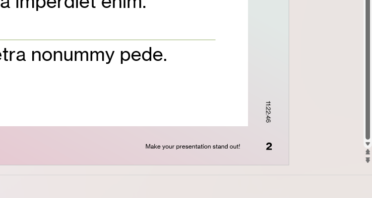
There are three types of footers you can add to your PowerPoint slides:
- Date and time footers can project relevance and immediacy and also give the impression that you created the slideshow as a one-off, aimed explicitly at your current audience.
- A slide number footer tells your viewers where you are up to in your presentation, adding a sense of continuity and progress.
- Text footers are an opportunity to drive home your key message or company slogan.
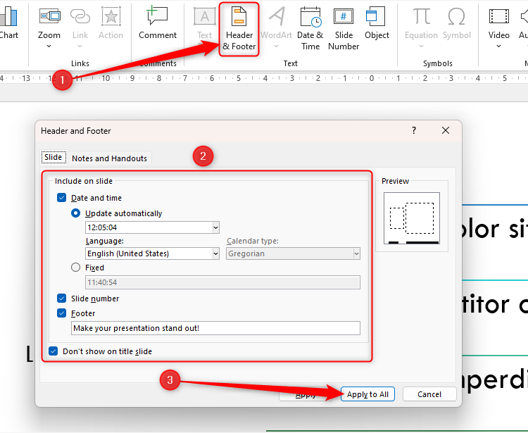
Click “Header And Footer” in the Insert tab to modify these options, and click “Apply To All” when you’re ready.
You need to add footers only to your content slides, not your title slide, so be sure to check “Don’t Show On Title Slide.”
Whether you choose to add one, two, or three of these footers to your slides, they’re a great way to make your presentation more professional.
3 Images and Diagrams: Make the Slides Stand Out
As the saying goes, “A picture is worth a thousand words,” and in no situation is this more apt than in a professional PowerPoint presentation. Images and diagrams add further detail to the text on your slideshow and make your presentation more memorable.
According to the Visual Teaching Alliance (via eLearning Industry), 90% of the information transmitted to the brain is visual, images are processed 60,000 times faster than text, and humans can register 36,000 visual messages per hour. So, why would you not use images and diagrams in your PowerPoint presentation?
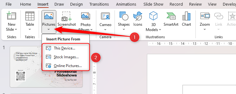
When you click “Pictures” in the Insert tab, you can either upload an image from your device, use one of Microsoft’s royalty-free pictures, or find an image on the web.
Just make sure they’re appropriate for the context of your professional slideshow, and don’t have too many on each slide—one or two should be enough!
4 Charts: Visualize Data
Well-labeled graphs add variety to your slideshow, break up the text, and help your audience understand what you’re presenting.
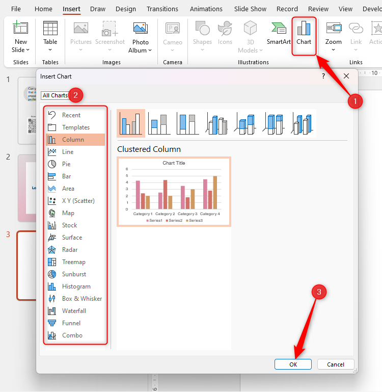
After clicking “Chart” in the Insert tab, select the type of chart that will help you visualize your information more clearly, and click “OK.”
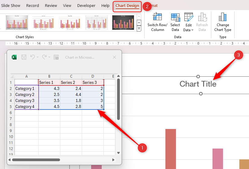
Use the mini Excel sheet to retitle your axes and insert your data, and the Chart Design tab on the PowerPoint ribbon is where you can adjust your chart’s layout. Double-click the chart title to give it a relevant heading.
Alternatively, you could create your chart in Excel before copying and pasting it to PowerPoint. This is especially useful if you need to access more advanced tools or have a lot of data to present.
5 Animations and Transitions: Control the Pace
As well as adding smooth visual touches to your slideshows, PowerPoint’s animations and transitions help you maintain your audience’s attention and set a pace that suits you.
Subtle emphasis animations (like Pulse) can be used to emphasize key points you want your viewers to notice, while entrance animations (like Fade) help you avoid overloading your audience by introducing one bullet point at a time. You can also use exit animations (like Disappear) to remove details that people no longer need to see.
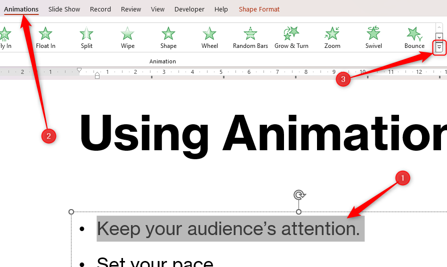
To add an animation, select an item, click the down arrow in the Animations tab, and choose one that works well in your presentation.
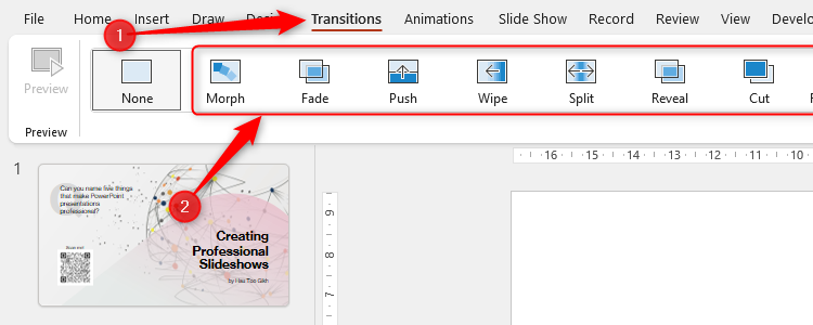
Carefully selected transitions—such as Fade and Peel Off—project a feeling of continuity and add a visual smoothness as you progress from one slide to the next. Simply click your preferred transition in the Transitions tab.
Selecting a transition defines how the presentation moves from the previous slide to the active slide. For example, if I were to select slide 2 and choose a transition, this would dictate how PowerPoint moved from slide 1 to slide 2.
The key to all of the above is to choose effects that are subtle, don’t take too long to run, and won’t adversely divert your audience’s attention. Your presentation will also be more professional if you limit the range of animations and transitions—stick to one or two animation types throughout your presentation, and use the same transition between each slide.
6 Consistent Colors and Fonts: A Professional Touch
Using a color scheme and no more than two fonts adds cohesion to what you’re presenting and gives you and your presentation a clear identity.
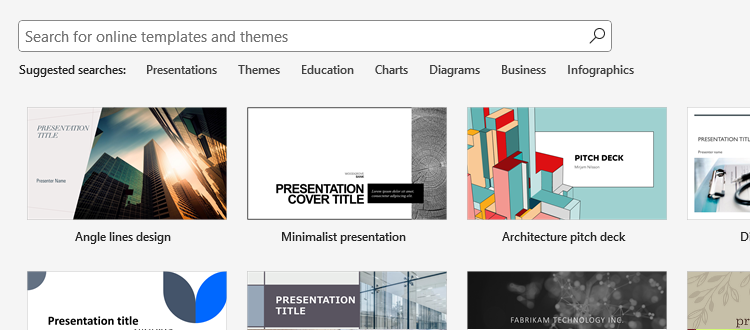
One option is to use PowerPoint’s design gallery, which you can access through the welcome screen when you first launch the program. These predesigned layouts already contain consistent color palettes, and you can use the search field to find a design that aligns with your theme. Minimalist designs are more appropriate for a professional presentation.
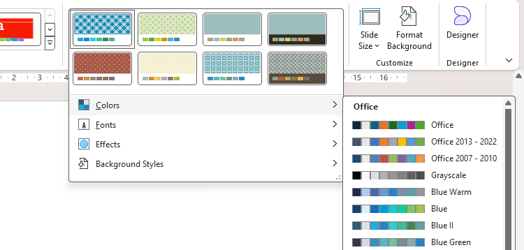
If you’ve already selected a theme, explore the color combinations in the Variants group of the Design tab.
Alternatively, if you want to design your own layout, remember the following tips:
- Don’t use red text. This often washes out when projected, especially if the sunlight hits your screen.
- The worst color combinations are blue with red, and green with red. Avoid these at all costs!
- Aim for dark fonts on a light background, or light fonts on a dark background.
7 The 6 x 6 Rule: Use Concise Bullet Points
Effective, professional PowerPoint slides shouldn’t be text-heavy. After all, you want your audience’s primary focus to be on you, with your PowerPoint there simply as a visual aid. The 6 x 6 rule suggests that you should have no more than six bullet points on each slide, and each bullet point should contain no more than six words.
A more concise PowerPoint also helps you, the presenter, to be more engaging. If your slides contain lots of text, you’ll naturally be more inclined to read from them directly. On the other hand, using your PowerPoint only as a cue card means you’ll talk to and make eye contact with your audience much more.
Of course, this is not a hard-and-fast rule—there will be times when using more than six lines or words per line is unavoidable. But it’s certainly a good principle to have in the back of your mind while designing your professional presentation.
Mastered all this? Next, take further steps to maintain your audience’s attention if you’re presenting your slideshow virtually, such as embedding your webcam, adding interactive features, and using a live chat.
Source link


