Android 16’s Quick Settings Could Be a Step Backward and Here’s Why

Android 15 recently hit AOSP and Google Pixel devices will be receiving them soon, followed by other manufacturers. It shouldn’t be surprising to assume Google has already started working on Android 16, and one of the first major changes the giant is planning is a complete revamp of Android’s notification and Quick Settings panel.
Android 12’s Quick Settings Change Was Terrible
For those unaware of why Google might be changing the quick settings experience, a vast number of users initially hated (and some still do) the panel when it first rolled out in Android 12. This was due to enlarged 1×2 tiles that take up lots of space, missing features, and the removal of useful tiles like Mobile Data.
A few of the highly requested features like expanded Bluetooth settings weren’t added until Android 14! The same goes with the Mobile Data toggle, which still remains integrated into the internet tile, and that probably won’t change with Android 16 either. However, the overall aesthetics of the Quick Settings and Notifications panel are changing.
Android 16 Quick Settings in Action
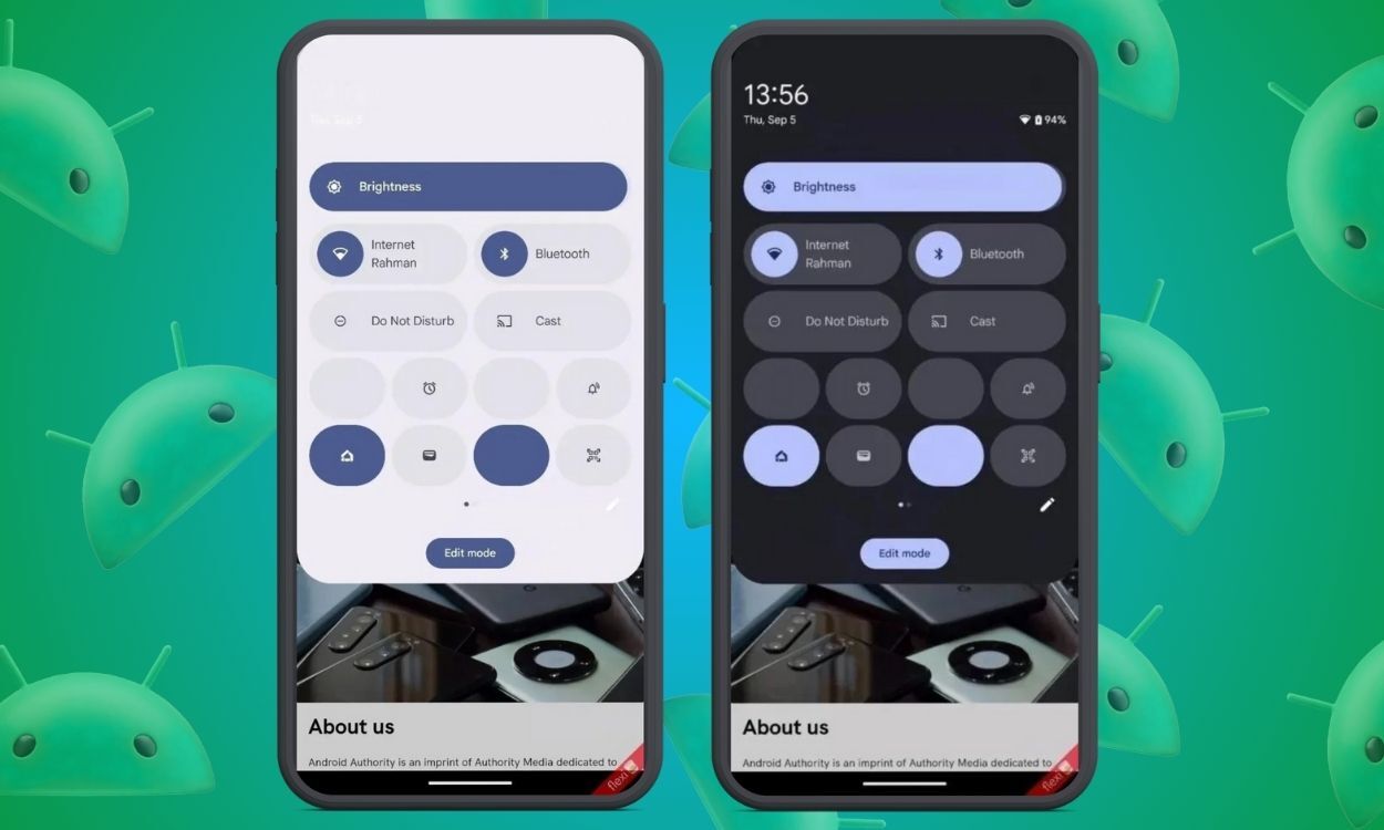
Android expert Mishaal Rahman enabled the new Quick Settings panel in Android 15 QPR1 and shared it via Android Authority. The new panel looks vastly different from Android 15. He claims this change will most likely launch with Android 16 instead of Android 15 QPR cycles.
While it’s still an early design, one of the first changes is the panel will now appear as an overlay and the dark shade below Quick Settings no longer exists.
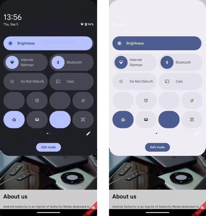
Another major and much-requested change is in QS tiles. While there are still four 1×2 tiles, the remaining will be all 1×1 size tiles; This way you can fit a total of 12 tiles (four 1×2 and eight 1×1) instead of 8 1×2 tiles currently. This will allow users to have more tiles in Quick Settings.

Finally, Google’s working on a light mode. Quick Setting on Android 15 still appears dark on Pixel UI and this is a welcome change. The best change of all, by far, is the new edit options.
Editing Tiles Will No Longer Be a Chore
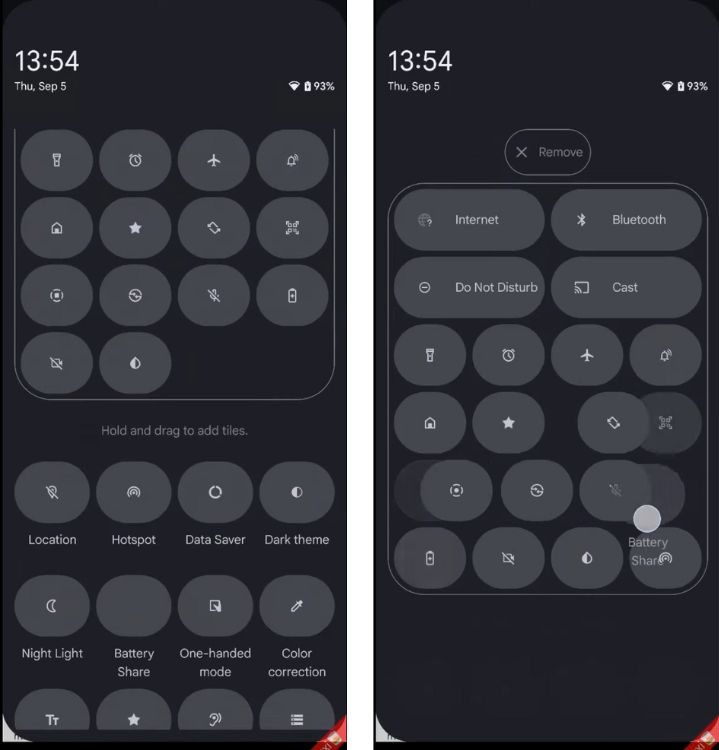
Editing and adding tiles to the current quick settings menu is a pain, due to the enlarged tiles taking up excess space. The drag-and-drop actions take time since you have to drag the tiles all the way to the top.

The edit section in Android 16 will be as easy as dragging and adjusting icons as you do with app icons on the home screen. This is all thanks to much smaller icons in both the main QS section and the tiles selection menu.
But Here’s a New Issue
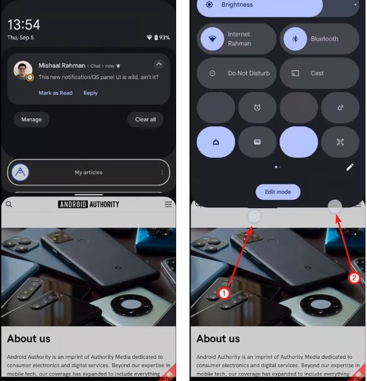
There’s one flaw in the new implementation that people may not like, and that is accessing the new Quick Settings. Android 16’s quick settings panel requires a two-finger swipe, and partial QS has essentially been eliminated.
There are no partial quick setting tiles anymore that you can access with just one swipe. Instead, swiping once will reveal only pending notifications. We hope Google doesn’t go ahead with this change, as it kind of robs the essence of “quick” settings.

One of the reasons behind this change could be the inability to access partial quick settings with one-handed usage on taller phones. Since people with such kind of phones use two hands anyway, a two-finger swipe would not take much effort, other than getting familiar with it during the initial days.
Also, notifications don’t seem to appear below the new expanded quick settings panel, at least not in the demo Mishaal shared, which is a bummer. If this is true, you’d need to first close the panel and do a swipe again to access notifications, which would not be “quick” by any means.
The bottom line is, that Quick Settings and Notification panels will be separated, similar to how Apple treats the Notifications Center and Control Center on iOS. This change reminds me of Quick Settings on Android Jellybean, where you would have to swipe to see notifications and swipe to the left to access Quick Settings.
Android 16 Quick Settings Looks Promising
And that brings us to the end of all the changes. So far, the new Quick Settings looks like a major revamp, and should please many Android users. However, having a separate notification panel and eliminating the partial quick settings panel might upset some users.
We recently saw Nothing revamping Quick Settings in its latest Android 15-based Nothing OS 3.0 Beta, and it goes to show how important Quick Settings is for Android users.
What are your thoughts on Android 16’s new Quick Settings panel? What other changes do you think Google should make in Android 16? Let us know in the comments.
Source link


