
There are 17 different types of charts in Excel, so it can sometimes be difficult to choose which one to use. In this article, we’ll look at 10 of the most useful for your everyday data, and how to use them.
To create a chart, select your data, open the “Insert” tab, and click the icon in the corner of the Charts group.
Once you have created your chart, you can double-click any of its elements to open the Format Pane on the right, where you can personalize the axis options, chart colors, data labels, and all other parts of your chart.
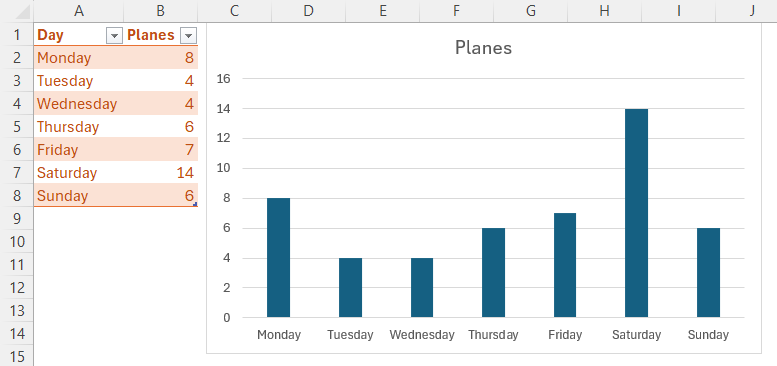
Column Chart
Column charts are the best way to show simple data comparisons.
In this example, the chart displays the number of airplanes (y-axis) that have flown overhead on each day (x-axis) of a given week. It’s easy to see which day had the most activity.

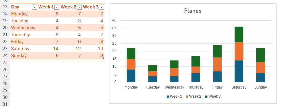
You can still use a column chart if you have multiple related data series. For example, let’s say we tracked the number of airplanes to have flown overhead each day over three weeks. This is where a clustered column chart would come in handy. You can see which day had the most activity over the three weeks, and each day is divided into three one-week periods, with colors representing each week.

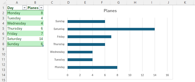
Bar Chart
Bar charts work exactly the same way as column charts, but the series names are on the y-axis, with the values along the x-axis. However, if you have series names with lots of characters, they display better on the y-axis than on the x-axis.
This bar chart shows the day of the week on the y-axis, and the number of planes on the x-axis.

As with column charts, you can use clustered bar charts to visualize multiple related data series at the same time. The color key will appear automatically.

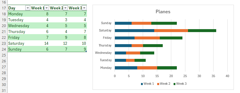
To reverse the groups (in the example above, move Monday to the top, and Sunday to the bottom), double-click the relevant axis, and check “Categories In Reverse Order” in the Format Axis pane on the right of your screen.
Line Chart
While column and bar charts are ideal for showing comparisons of a simple data set, line charts effectively display a linear trend over time.
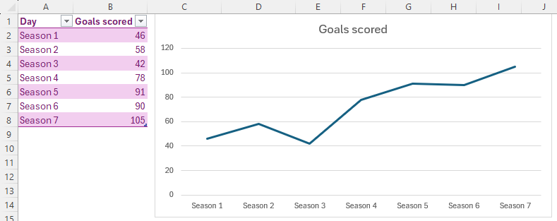
Here, you can see the number of goals a team has scored over the course of three seasons. It’s easy to quickly identify that the team is gradually getting better in front of goal.

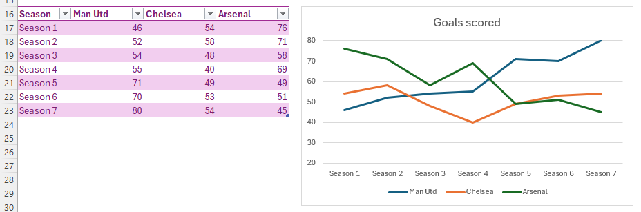
If you have more than one variable in your table, Excel will pick these up when you choose to represent your data as a line chart. The line chart in the screenshot below enables you to quickly see that Man Utd are scoring more goals each season, Arsenal are scoring fewer goals as time goes on, and Chelsea are staying about the same, except for a dip in season 4.

Area Chart
An area chart is essentially a line chart, but the area under the line is filled in.
The benefit of the chart having this additional color is that it more clearly represents large variations in data. Also, when you use an area chart with various data sets, the comparisons between these variables are even easier to see than in a line chart.
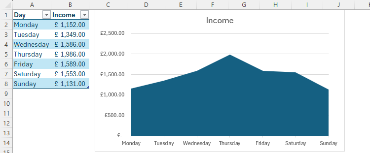
In this example, the color under the line is the total accumulated income, so color is good! The chart also clearly shows us that income peaked on Thursday, and dropped back off at the end of the week to where it started on Monday.

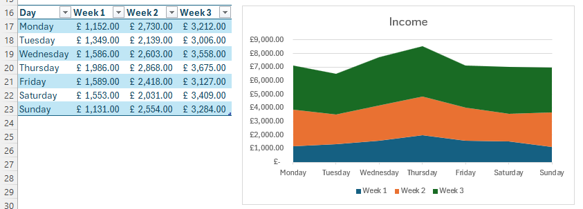
When we plot the income data for three weeks, the area chart gives us a couple of things to note. First, it’s clear that Thursday is the best day each week for income (see how it peaks for Thursday in all three colors), and second, we’re making more money as the weeks go on (notice how the orange segment takes up more of the chart’s area than the blue, and how the green takes up more than the orange).

Pie and Doughnut Charts
Other than making you feel hungry, pie and doughnut charts represent each part of your data as a proportion of the whole. Using this type of chart makes it easier to estimate percentages.
In the table below, we counted the number of each type of aircraft that flew overhead. The resultant pie chart shows each type as a wedge, while the doughnut chart uses arcs in a circle. Notice how quickly you can see that just over a quarter of the planes were Hawk T2s.


Hover your cursor over each wedge or arc to see the exact values. You can also add data labels by selecting the chart, clicking the “+”, and checking “Data Labels.”
Histogram
Where bar and column charts show individual values for each series, histograms group data together to show frequency distributions.
In this example, we have 20 students and their exam marks. We want to break up the marks into groups of ten (for example, 50 to 60, 60 to 70, and so on), and see how many students landed in each group. Here’s what we end up with.

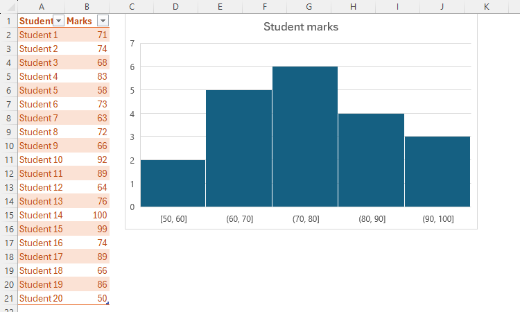
However, to achieve this, we had to take a crucial step. The group widths (also known as bins) were not automatically set to ten. To change this, we right-clicked the x-axis, clicked “Format Axis,” and changed “Bin Width” to 10.0. If you prefer, you could adjust the number of bins (rather than their scope).
Square parentheses in the
x
-axis represent numbers included in the bin, whereas round brackets represent numbers not included in the bin. So, for example, (60, 70] means that the score of 60 is not included in that column, but the score of 70 is.
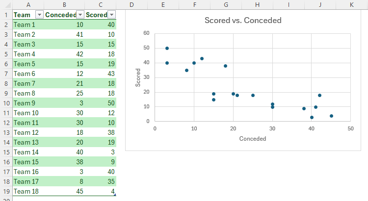
XY Scatter Chart
XY scatter charts are a great way to see if there is a correlation between two data sets.
In this example, we’ve plotted goals conceded versus goals scored. We can see straightaway that teams who score more goals (y-axis) tend to concede fewer (x-axis), and vice versa.

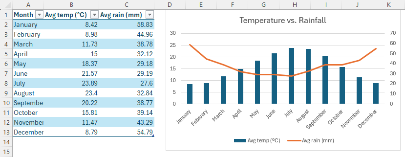
Combo Chart
Another way to assess correlations between two variables is through a combo chart.
Here, our table shows the average temperature and average rainfall across a year. It’s clear to see in our combo chart that the higher the temperature, the lower the rainfall.

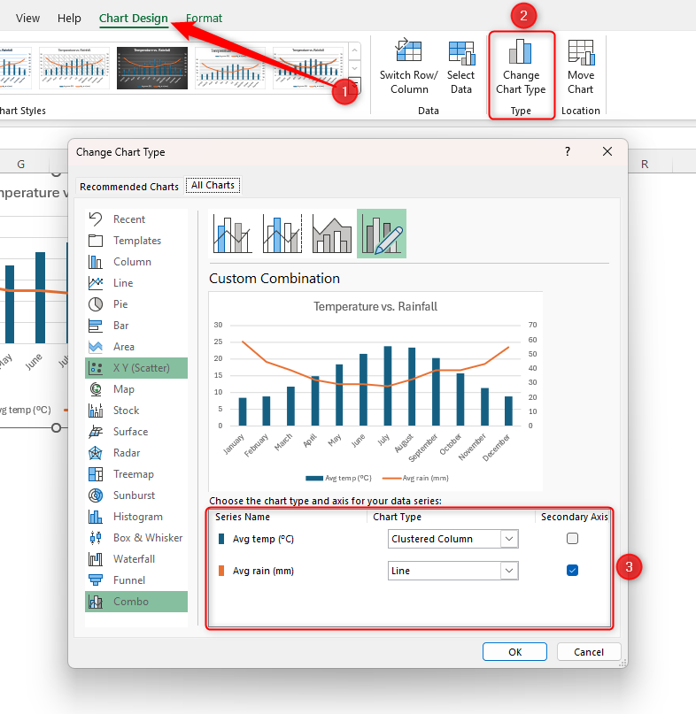
To change how each data set is visualized, select your chart, click “Chart Design,” and then click “Change Chart Type.” You can then change the settings in the dialog box that opens.

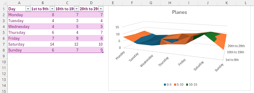
3D Surface Chart
These types of charts allow you to see optimal combinations between different data sets using a 3D map and colors.
Going back to our plane spotting, we want to know when we are most likely to spot aircraft flying overhead. The 3D surface chart tells us that Saturdays are the best days, particularly early in the month. It also tells us to not be too hopeful on Tuesdays and Wednesdays.

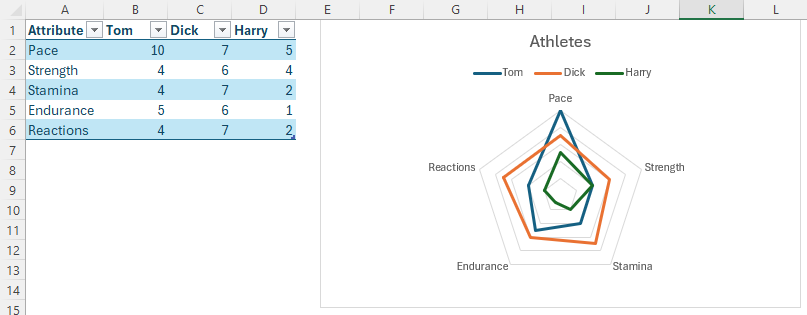
Radar Chart
Radar charts visualize comparisons of various characteristics.
Let’s say we’re an athletics coach, and we want to see how our athletes compare in terms of their attributes. The radar chart below clearly indicates that Tom’s biggest asset is his pace, Dick is a good all-rounder, and Harry needs to improve in all areas. Not only do the points in the chart indicate specific characteristics, but the areas of the plots also tell us the overall comparative values.

Once you’ve created your chart, try going one step further by highlighting the minimum and maximum values to make them stand out. Or, even better, you can combine your charts with drop-down lists to make them dynamic.
Source link
- Polskie kasyna online z turniejami dla graczy.596
- Najlepsze Kasyna Online w Polsce w 2025.10590 (2)
- Gioco Plinko nei casin online in Italia.2170
- – Официальный сайт Pinco Casino.8053 (2)
- Casino Mostbet Azrbaycan.1032
-

- B7 Casino NL — Bonus €450 en 250 gratis spins.2447
- 7Slots Casino – 7Slots Casino giri.30
