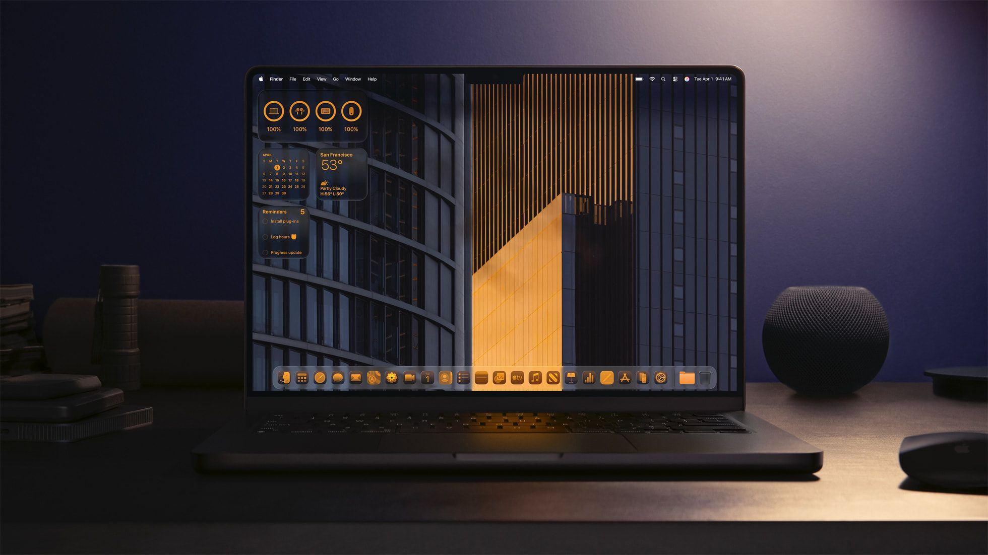
At the June 2025 WWDC event, Apple unveiled a major and comprehensive overhaul of its entire operating system family across all its devices. One of the most apparent changes is the introduction of “Liquid Glass”, which dramatically changes how UI elements look and behave.
This (predictably divisive) change is undergoing strong criticism on social media, especially when it comes to legibility on iPhones, but personally, I think that macOS in particular will benefit a great deal from the new look. There’s never been any major UI change to Apple’s systems without controversy, but I’m going to go out on an early limb and say I quite like it so far.
Related
Your Mac Is Getting ‘Liquid Glass’, Spotlight Upgrades, and More
The macOS Tahoe 26 update is coming later this year.
The Liquid Glass Visual Language Promises to Distract on Phones and Tablets
First, I absolutely agree that in its current form in the various OS betas, Liquid Glass looks visually noisy, and thanks to the simulated light distortion, any motion while swiping or operating things on-screen can look distracting. So it’s not ready for prime time yet—hence the beta.
Personally, I like the way things are going here, and I think any issues are totally fixable and will likely be sorted during beta. All that has to happen is more opacity, or some other mitigation to prevent so much visual noise, but I think that can be achieved while keeping the essence of what makes Liquid Glass cool.
There are also some legitimate worries about how these GPU-powered UI light simulations will impact battery life and perhaps performance on older devices. The beta period is, of course, fairly lengthy. So, as beta testers get to grips with Liquid Glass, we should have a better idea of its side effects.
Related
Apple’s iOS 26 Has a New Design And Tons of New Features
One of the biggest updates we’ve seen.
Now You Can Give Your Desktop a More Cohesive Look
However, I am much more interested in how Liquid Glass will shake out on macOS. The big difference here is that UI elements are much more spaced out on a Mac desktop than on an iPhone. You also don’t have nearly as many layers sliding over each other, so a situation where a bunch of Liquid Glass elements all slide and distort over each other is much less likely.
Related
macOS 26 Tahoe: What’s New, Compatibility and Release Date
Here’s what the fall’s free macOS update will bring to your Mac.
While it made sense to limit how much user customization could be done on an iPhone (I’ve seen some truly unusable custom Android themes) on a personal computer I think it’s reasonable to give people more control over what UI elements look like and to change their colors and appearance.
Right now, there’s some transparency on the dock and some window elements, but widgets, for example, are all over the show. If everything is unified using the Liquid Glass design language, then you’re going to get a more cohesive desktop, as in this official Apple photo,
It’s not like macOS currently doesn’t let you do quite a bit to make everything fit, but I really think Liquid Glass is an opportunity to align the look of macOS again after years of slow creep in different directions for its various components.
That said, I do hope that in the final build of macOS Tahoe, we’ll get a significant amount of control over how Liquid Glass presents on a given computer. Such as reducing the optical refraction effect, or tuning the opacity of the glass layers.
Related
iPadOS 26 Makes Your Tablet More Powerful Than Ever
iPadOS 26 gets a neat new windowing system, and more.
An Option to Turn It Off Would Be Nice Though
Most importantly, even if Liquid Glass turns out to be great and widely accepted, Apple still needs to give us the option to turn it off. A personal computer is, well, personal. More so than a smartphone or a tablet, at least in my opinion. So, if someone doesn’t like the look of Liquid Glass, then returning to a more traditional look should be on the table.
Related
Apple MacBook Pro M4 Pro Review: Apple Makes a Masterpiece
One step away from perfection.
I’ve seen plenty of comments saying that Liquid Glass is just a rehash of Windows Vista and the Aero design language. While it’s very different on a technical level, there are definitely things that end up being reminiscent of Windows Vista and 7. However, what’s wrong with that?
It’s pretty normal for design fads to go around in circles, so maybe after Liquid Glass, we’ll go back to skeuomorphic apps with felt textures and woodgrain–and we’ll like it.
Source link
